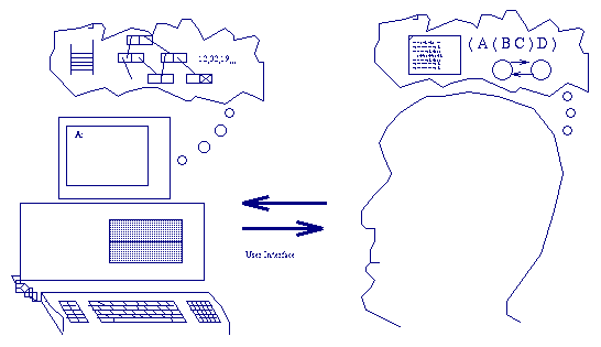
Figure 2.1. The Role of the User Interface
[NOTE: this is only a translation into English of the original paper. No corrections or updates were made. Part 5 is no longer a good description of the user interface in the Merlin Project.]
This paper will show some GUI trends and the ideas that are being developed in the Merlin Project. Part 2 introduces some UI concepts and part 3 presents the evolution of the window/menu systems. In part 4 the Artificial Reality from Stanford University ( from which this proposal is derived ) is described, as well as a similar system being developed at Xerox. Part 5 shows some problems to be solved and part 6 concludes this work.
Figure 2.1 shows a person using a computer. In the computer's memory and on its disks there are various data structures that are sometimes quite complex. The full set of data structures forms the internal state of the computer. The person using the computer keeps a similar structure inside his head - the mental model of the computer. The two structures are not exactly the same, of course, for then the machine would not be needed at all. The internal state of the computer normally has much more information than the mental model ( there are exceptions - what the machines "sees" as an unstructured group of pixels on the screen might be a complex diagram for the user ).
The user interface has two functions: to reveal the internal state to the user and to change the internal state as directed by the user. A command like "DIR" only reveals the internal state and lets the user update his mental model. This is important as a person can only make decisions based on the model, for the internal state is not directly accessible. The command "RENAME TEXT.DOC NOTE.DOC" only changes the internal state. Most application programs, however, include both functions at the same time.
If the user turns on the machine and is greeted by a "A>" (or worse: just a blinking cursor"), he will have few elements with which to build his internal model. Fortunately, other components can help the UI in this task: manuals, more experienced people and formal training are among the most important of these. These solutions were practical when the number of users was reduced, but the virtual explosion of personal computing in the last decade has made these costs unacceptable and has increased the interest in UI developments.
If the communication channel between the machine and the user was very limited (teletype or dumb terminal), the reverse channel was just as poor, normally limited to a typing machine-like keyboard. This led to the creation of modes[8] where the user's actions have different meaning depending on the computer's internal state. The "Q" key, for example, might insert the letter "q" in a text, quit the application, turn off the sound ( "quiet" ) or anything else that the programmer's imagination might come up with.
Modes have several problems. They are rarely clearly indicated which makes the user's mental model get "out of sync" with the internal state, causing a lot of confusion. Operating modes greatly increase the complexity of a system, making the user type many mode-changing commands before he can execute the command he is really interested in. The situation where the computer asks "File to be loaded?" (which indicates that the system is in a mode where what is typed will be interpreted as a file name) but the user can no longer remember the exact name is both common and frustrating. The user knows that the "DIR" command at the system prompt will reveal the needed information. The problem is that there is no way to switch to that mode and then come back to the first one. The use of modes imposes a rigid structure in the man-machines dialog, which makes the programmer's life easier, but not the user's.
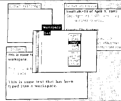
The Smalltalk Project[5][4] developed in the 70s at the Xerox Palo Alto Research Center created, among other things, the user interface shown in Figure 3.1. The keyboard was freed from the many operating modes, being reduced to just text entry. The mouse appeared to move the cursor on the screen and to start operations. The generous use of images shows much more of the internal state of the computer than did previous interfaces. The screen is divided into rectangular windows that can be overlapped forming a "two-and-a-half" dimension structure. Commands are initiated through small windows, the menus, that pop up when a mouse button is pressed. The menu's contents depend on the position of the cursor when the button was pressed. So the system does have modes, but they are highly visible (they are associated with distinct areas on the screen) e the time needed to move from one to another is just a fraction of a second. The user was now in control, and the programmer had to live with the complications of trying to implement this feature.
The computer screen has a fixed size, which limits the amount of information that can be presented to the user. Figure 3.1 doesn't seem to make a good use of the available space as it wastes areas with no windows at all or with windows that are mostly covered so that their contents can't be identified. An alternative that has been tried ( in Microsoft Windows 1.0 ) was the tiled window model. The screen was divided among totally visible windows. As the number of windows grew larger, however, they started to become so small that they could no longer be used. The overlapping window systems are based on the fact that humans really only do one thing at a time, and dedicates most of the screen to the task that the user is focused on in that instant. This suggest another alternative ( used, for example, in early versions of the QNX operating system ): dedicate the whole screen to the "active" window. A simple command can replace one window with another. This solution is, in practice, not as good as the first one for the user's mind can fill in the rest of the contents of an obscured window from the mental model. It is as if the person could see all of the windows at the same time, which would take up an area several times larger than the screen. The complete disappearance of the unused windows would make them more abstract - "out of sight, out of mind".
The famous "desktop metaphor" was introduced in the Xerox Star computer[7]. Icons, little pictures, were added as an alternative representation for windows. Like the partially obscured windows, they keep a "foothold" in the user's mind while saving screen space. The icons also help the user visualize and manipulate complex data structures as simple entities. This lead to the development of direct manipulation: to print a text, just move ( with the mouse ) the text icon to the printer icon without having to invoke an explicit command.
An environment that emphasized direct manipulation was ARK[6] - the Alternate Reality Kit. The contrast between concrete/abstract and choose/recall identified during the Star's development were even more evident in this system. In the referred paper, Randall Smith calls the elements that follow the metaphor "literal", while those that break the metaphor are "magical". As a rule, the literal elements make the system easier to learn, and the magical easier to use. A UI must create a balance between the two extremes (the text based interfaces, which can be considered based on the "boss-worker dialog" metaphor, are simply too magical).
The Apple Macintosh UI made all of the elements mentioned so far very popular and has standardization[1] as its strong point, which is also an important factor in the ease of learning. When there is a consistency between application programs, elements that were magical in the first programs become literal in the next few as they become a permanent part of the user's mental model.
One very interesting Apple product, Hypercard[10], abandoned the company's standards to deeply explore direct manipulation. The user can directly create the application's interface (with no windows or menus in the first version) without writing a single line of code. For more sophisticated applications, the Hypertalk language can be used to complement the large collection of predefined "buttons". Hypercard, like Smalltalk, ARK and several other systems, links a GUI with object oriented programming. This is no coincidence - the internal state of conventional systems is not sufficiently structured and the attempt to expose as much as possible of this state to the user through a GUI makes this weakness obvious. An object oriented system tries to make the machine's internal state closer to the mental model most people develop while other systems try to close the gap in the opposite direction.
The objective of the AR is to create a direct correspondence between the user's mental model of the computer and the image on the screen. This will make the screen complement the person's memory, freeing his mind to concentrate on the work to be done, rather than the mechanism of doing it. The Stanford system and ARK were the inspiration for the Merlin project, but there are some missing pieces. It is very important that the objects have persistence - that is: they must continue to exist even when the computer is turned off. This could be done with a traditional file system, but the result would not be satisfactory. The idea of "files", so natural for people who are used to computers, is the biggest hurdle for novices. In the real world, is a person scribbles on a sheet of paper on a table, he can expect to find the paper in the same place and in the same state the next day (not taking into account actions by external agents). So must the AR eliminate "LOAD" and "SAVE" commands, as well as all the file related "residue".
A small number of objects can quickly fill up a high resolution screen in Self's AR. While the amount of memory, the processing speed and several other factors rise by a dizzying rate each year, the screen resolution is not expected to go beyond that of workstations (which is practically the same since the first models). The "Information Visualizer"[3], being developed at Xerox, has two solutions to this problem. The illusion of tridimensional images makes a better use of the human visual perception. Just as with the partially covered windows, the important thing is what seems to be, and not what is. A single image is very incomplete, but the animation of objects in space gives the brain the familiar stimuli that help form an adequate mental model. Xerox has shown how a normal screen can hold hundreds of objects, which would be impossible to grasp without the use of 3D. Another factor in coping with the increasing number of objects is their organization into separate "rooms", according to the activity in progress. In the "drawing" room, there are only objects related to this task, as in the programming room, the writing room or the mail room. The objects may be moved from one room to another as needed.
An important aspect of AR is that objects have a unique identity. The problem is that an object might be useful in more than one form. In the window based system this was achieved by examining the same object through different tools. In AR this can be done by having multiple object "faces". Only a single face can be seen (and manipulated) at a time, but if another form of the object is needed it can be turned in 3D space to show another face with different functionality. A little "magic" is introduced here by allowing an object to have as many different faces as necessary, even though the screen image would seem to indicate only two. The important thing is that no matter how radically the object's appearance changes, its identity as a single entity is always clear.
The objects, when seen from far away, can function as icons. When close by, they can be used as windows. Unfortunately, windows normally introduce an abstraction: they show only part of their contents and have scroll bars or similar mechanisms to allow the rest of the object to be seen. An object should not hide anything, but if it is, for example, a book, it will fill the whole screen before it is sufficiently close to be read. This would eliminate most of the advantages of the system, as proposed so far. The solution is to have "lenses". The object is kept at a distance where all of its content may be seen, even if it is unreadable. In another part of the screen, a rectangle (the lens) shows an enlarged part of the object that can be easily read and manipulated. The lens can be adjusted to show a different part of the object, which is equivalent to a scroll. More than one lens can be focused on the same object at the same time to compare different parts or to show different degrees of enlargement. The lens is, of course, a tool in the sense described earlier. It does not have the problems associated with most tools, however, as it is transparent (that is: it calls attention to the object being observed rather than to itself - the functionality shown is the object's, not the lens') and is a system level mechanism. The applications have a simpler implementation for they just need to define the methods used by the lens.
This whole discussion about 3D interfaces might not seem very practical. After all, the Information Visualizer needs a Silicon Graphics workstation. The processing capability of computers will continue to increase and the prices will continue to fall in the future, but some "dirty tricks" can be used for now. As the objects can present several faces, as described before, and can only turn when told to do so by the user, we will impose the restriction that as the user navigates through 3D space the objects are always seen at the same angle. So what would have been a perspective calculation becomes a simple 2D translation or scaling. Even the 2D scaling can be simplified by using pixel replication during quick movements and doing the full recalculation during pauses (when the distortion produced by the simplified operation would become noticeable). Similarly, other aspects of the system can be adapted to the available computational capacity.
Another problems being considered is that of object names. The hierarchical name space used in Unix and other has a simple visual representation. But is has some serious limitations, so an alternative based on set intersection is being tried in the Merlin Project. It is not clear if a reasonable graphical representation for this idea exists, however.
[1]  Apple Computer Inc. - "Inside Macintosh Volume I"
     Addison-Wesley Publishing Company Inc., 1985, Chapter 2

[2]  Chang, B. W. & Ungar, D. - "Experiencing SELF Objects: An
                               Object-Based Artificial Reality"
     unpublished 1990

[3]  Clarkson, M. A. - "An Easier Interface"
     Byte, Feb 1991, pp. 277-282

[4]  Goldberg, A. - "Smalltalk 80: The Interactive Programming Environment"
     Addison-Wesley Publishing Company Inc., 1984

[5]  Kay, A. & Goldberg, A. - "Personal Dynamic Media"
     IEEE Computer, Mar 1977, pp. 31-41

[6]  Smith, R. B. - "Experience with the Alternate Reality Kit: An Example
                     of the Tension Between Literalism and Magic"
     IEEE Computer Graphics & Applications, Sep 1987, pp. 42-50

[7]  Smith, D. C. & et al. - "Designing the Star user interface"
     Byte, Apr 1982, pp. 242-282

[8]  Tesler, L. - "The Smalltalk Environment"
     Byte, Aug 1981, pp. 90-147

[9]  Ungar, D. & Smith, R. B. - "SELF: The Power of Simplicity"
     OOPSLA'87 Conference Proceedings, pp. 227-241

[10] Williams, G. - "Hypercard"
     Byte, Dec 1987, pp. 109-117